A personal redesign project focused on simplicity, smart UX, and elegant UI.
Project Overview
Academica is a personal passion project, born from a desire to elevate the online learning experience. This redesign isn’t just about aesthetics; it’s about fundamentally improving usability and emotional engagement in digital education.
What is Academica?
A conceptual online course application, reimagined for a superior user experience.
What is Academica?
A conceptual online course application, reimagined for a superior user experience.
Many popular online learning platforms often suffer from cluttered interfaces, dated visual design, and inconsistent user experiences. This can lead to learner fatigue and a disengaged educational journey.
"What if online learning felt more human, elegant, and motivating?"
Outdated UI
Visual designs that feel behind the curve, lacking modern aesthetic appeal.
Cluttered UX
Overwhelming information density and unintuitive navigation paths.
Lack of Engagement
Generic interactions that fail to foster a connection with the learning material.
Project Goals & Hypotheses
My primary objective for Academica was to create an online learning environment that not only looks good but deeply resonates with users, making education an enjoyable and seamless process.
Visual Clarity
Simplify interfaces for better readability and reduced cognitive load.
Seamless Onboarding
Design an intuitive first-time user experience, guiding them effortlessly.
Personalization
Tailor content and experiences based on user preferences and progress.
Emotional Engagement
Utilize color, motion, and structure to foster a positive, motivating learning atmosphere.
User Journey: From Splash to Course Home
Understanding the user’s path is crucial. This journey map details the key touchpoints and micro-interactions designed to create a smooth, engaging experience from the very first tap.
1
Splash Screen
Dynamic logo animation (Figma Smart Animate).
2
Welcome Modal
Engaging greeting to set a positive tone.
3
Sign Up
Streamlined process with clear progress indicators.
4
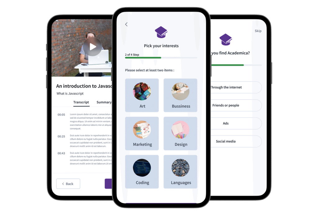
Interests Selection
Personalized content suggestions based on user input.
5
Quick Survey
Gathering preferences for a tailored experience.
6
Home Dashboard
Personalized content and quick access to courses.
7
Course Page
Intuitive layout for learning and tracking progress.
Key UX Highlights
Academica focuses on thoughtful design decisions that enhance usability, personalization, and user engagement throughout the learning process.
Personalized Onboarding
Interest selection for tailored content feeds.
“How did you find us?” for insights.
Smart Learning System
Course resume functionality for seamless continuation.
Dedicated transcript and summary tabs for easy review.
Engagement & Tracking
Interactive progress bar during sign-up.
Profile statistics bar chart for study time visualization.
Visual System & Brand Palette
Academica focuses on thoughtful design decisions that enhance usability, personalization, and user engagement throughout the learning process.
Typography: Source Sans Pro
Color
Usage
Purpose
Purple Gradient
CTA & Brand Accents
Primary brand color, calls to action, visual emphasis
Neutrals
Text & Background
Readability, clean interface, content focus
Blue
Tabs, Progress Indicators
Informational states, current selection, progress tracking
Green
Success Feedback
Positive affirmations, completion indicators
Red
Alerts, Errors
Warnings, critical feedback
Brown
UI Warmth, Secondary Elements
Adding warmth and depth to certain UI components
Concluding Insights
Academica is more than just a redesign; it’s a testament to the power of thoughtful UX/UI in transforming digital experiences. It demonstrates a holistic approach, from micro-interactions to overall user flow.
Realistic Interaction Logic
Implemented complex behaviors using Figma variables for authentic user experiences.
Deep Emotional Branding
Cultivated a unique brand identity that evokes joy and motivation in learning.
Full User Flow
Designed a comprehensive journey from initial entry to final course certification.
Thoughtful Micro-Interactions
Integrated subtle animations and transitions for an intuitive and delightful interface.